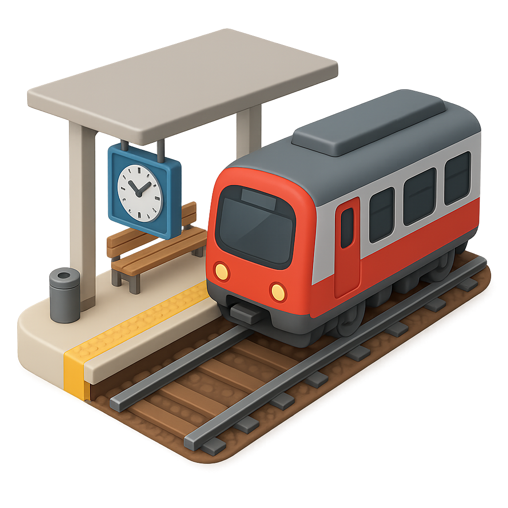
Making transit simple: designing a seamless transit app for Vancouver.
duration
4 Weeks
Location
Vancouver, BC
role
UI/UX Designer
Tools
Figma
Overview
Born out of riders’ frustration, OneStop reimagines Vancouver’s transit experience by combining fares and trip planning in one place.
project outcome
Initially an idea while commuting to work in Vancouver, it evolved into designing a seamless experience, allowing riders to navigate their day with ease, confidence, and trust in the transit system.
The problem
Public commuting in Vancouver is functional but lacks efficiency.
Outdated systems, physical fare cards, and unreliable updates frustrate users. Commuters often manage multiple accounts and struggle with transfer times and bus locations.
No mobile app available
Unreliable transit schedules
Planning a trip is a struggle
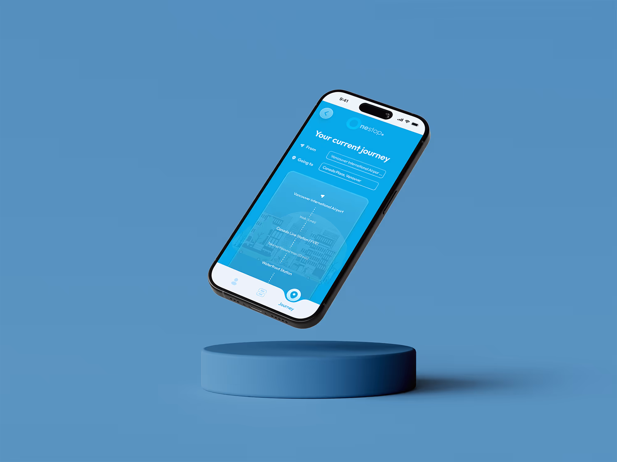
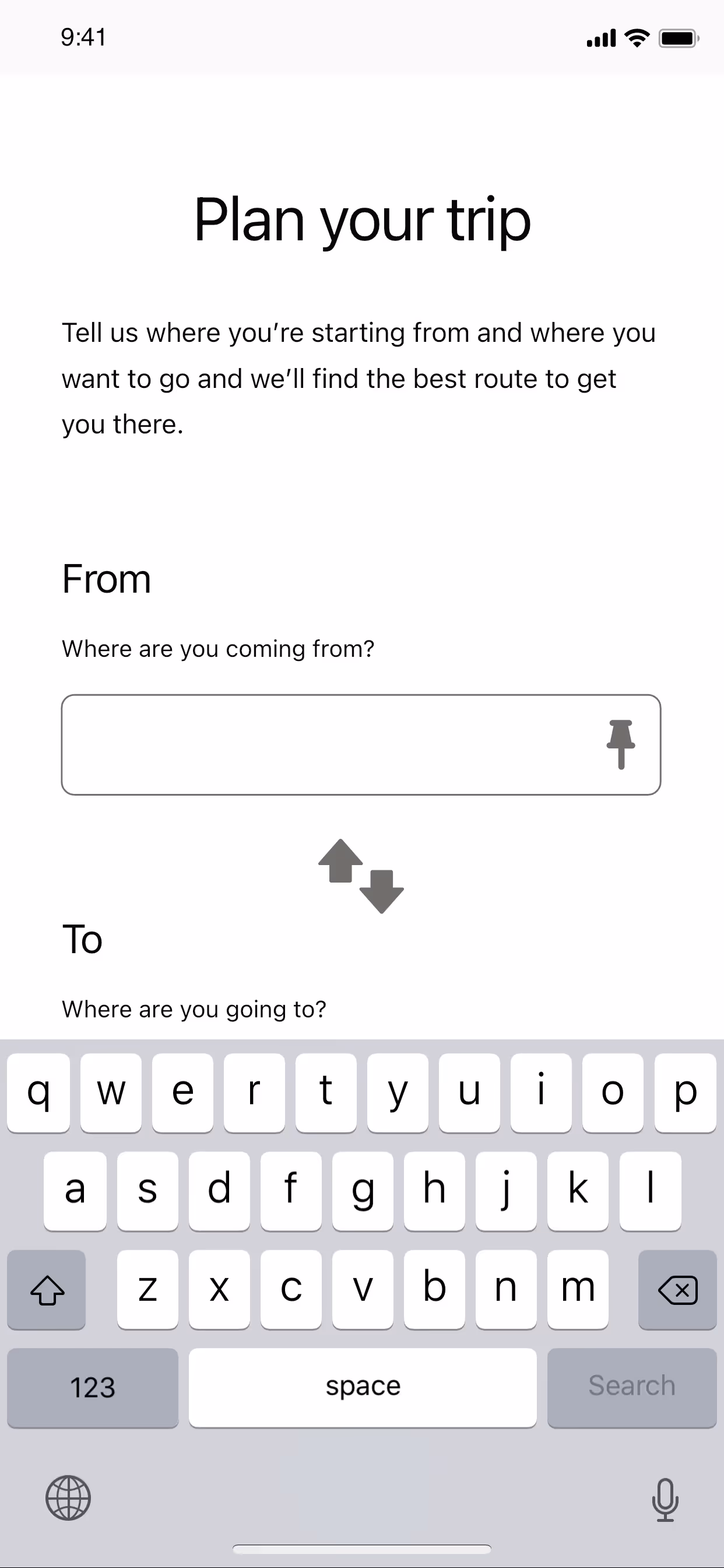
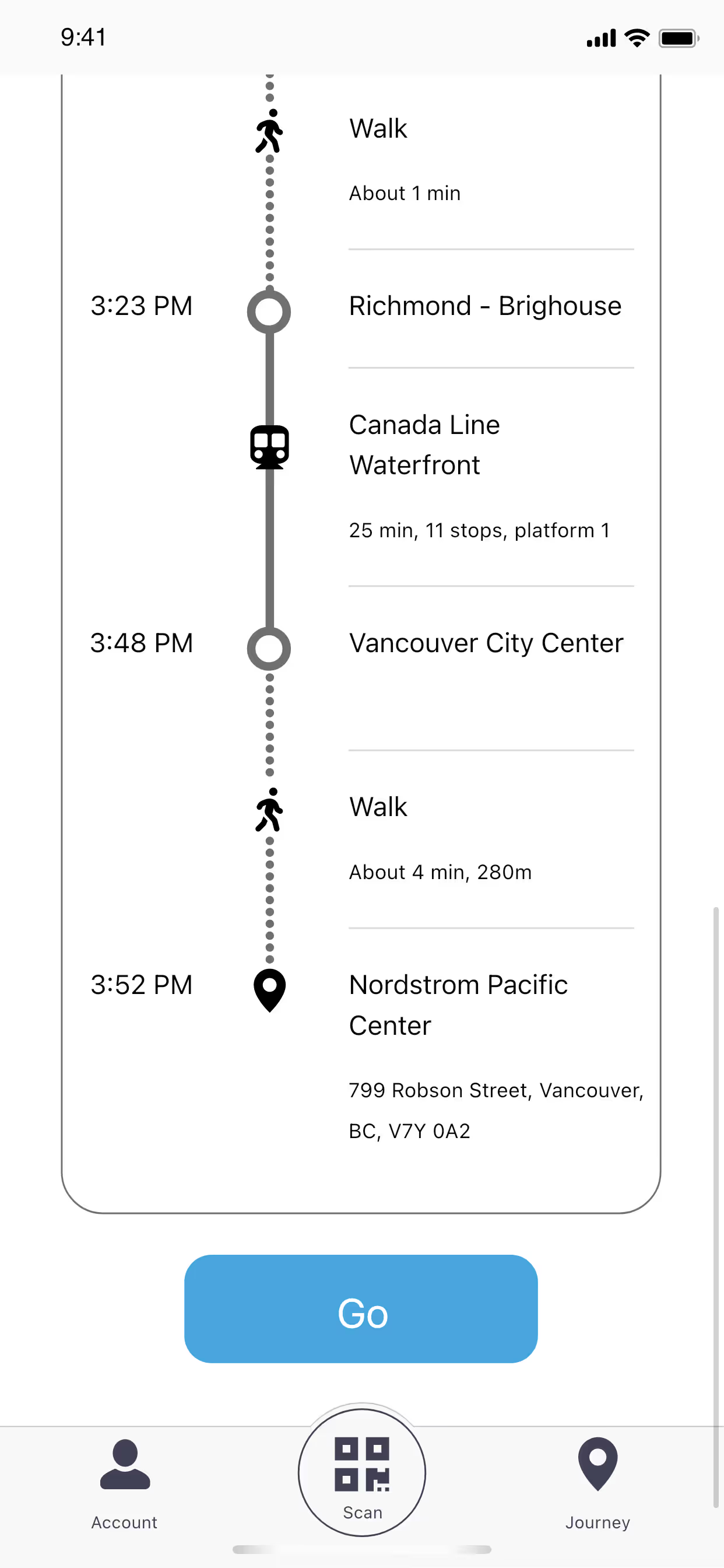
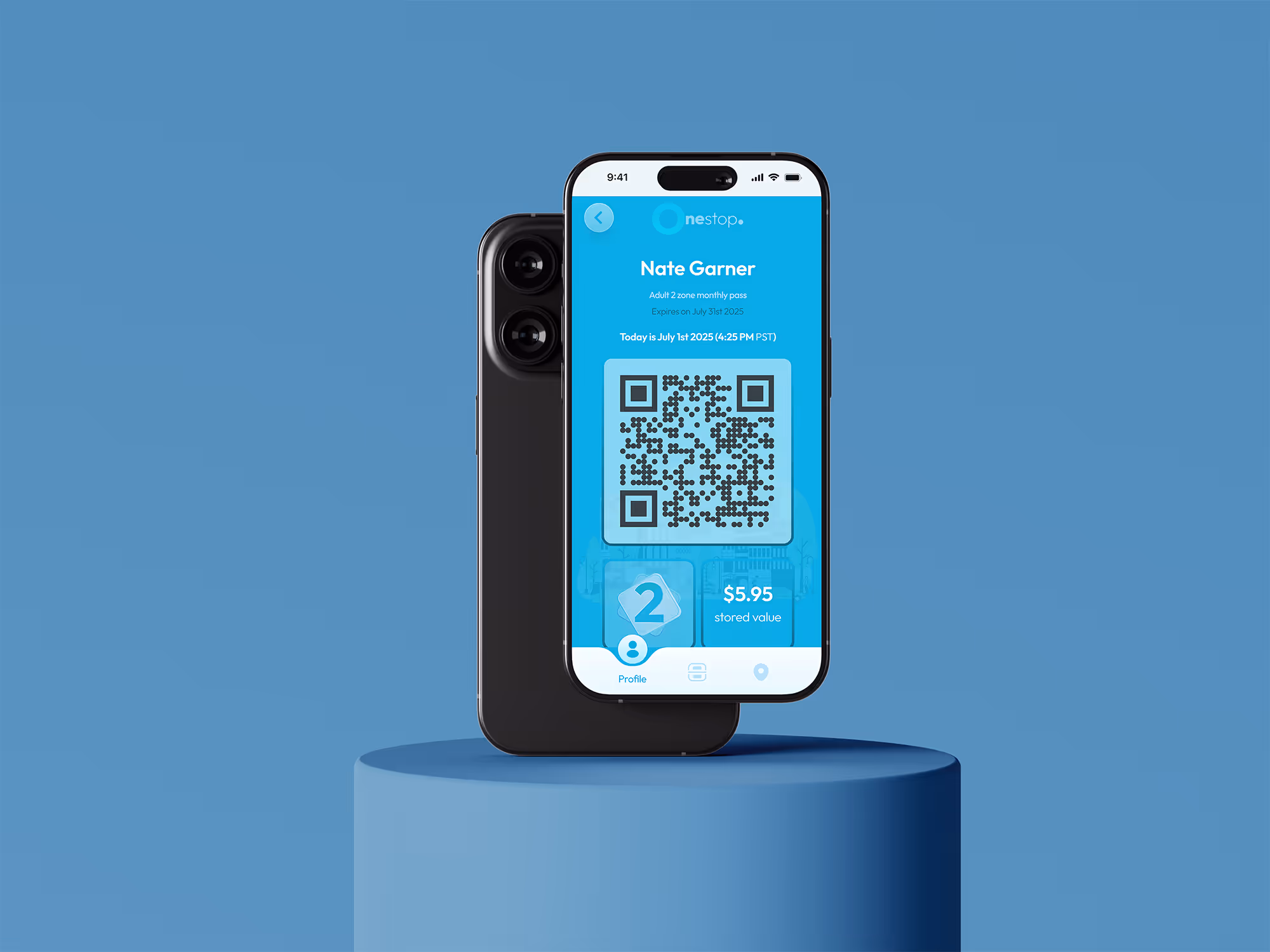
The solution
I designed a mobile app that allow users to plan trips, make transfers, and reach their destinations, stress-free.
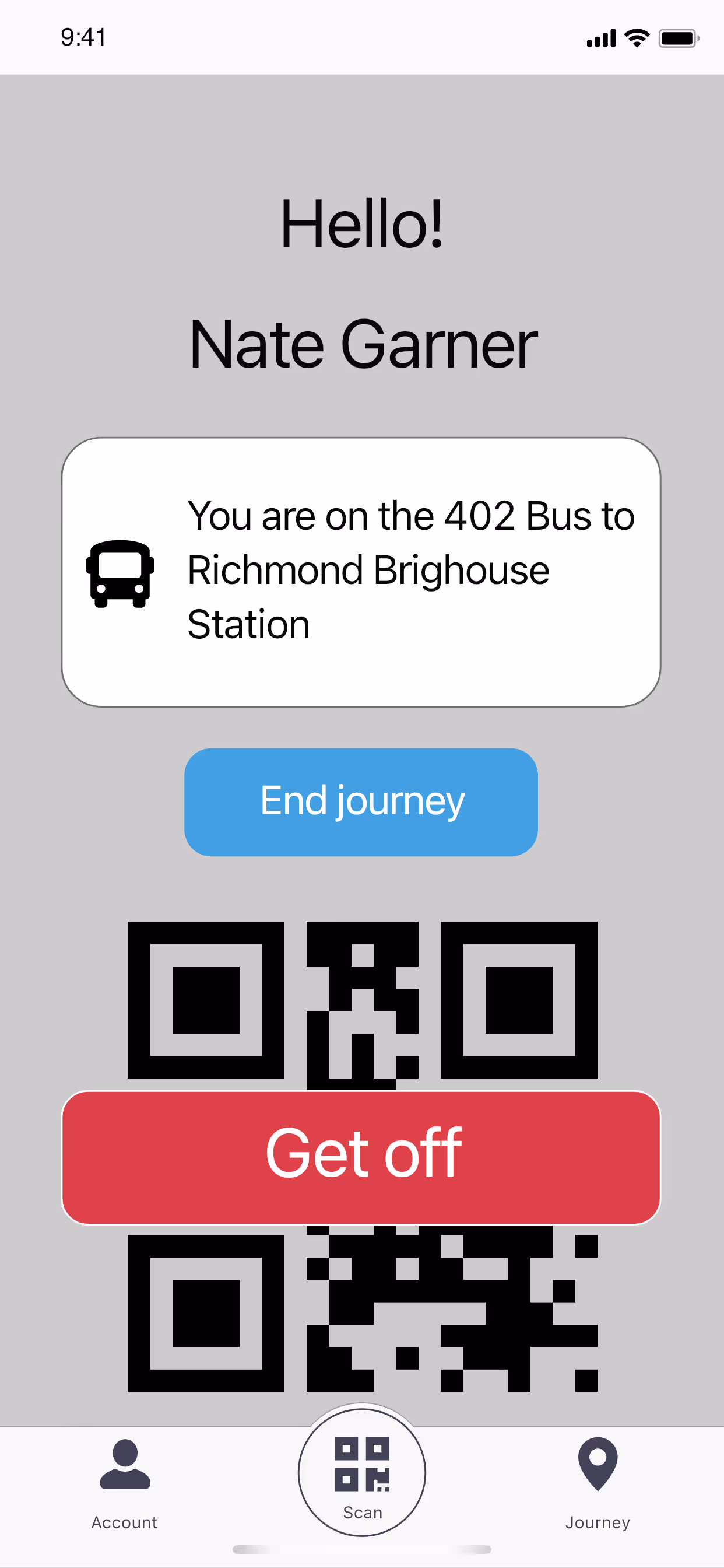
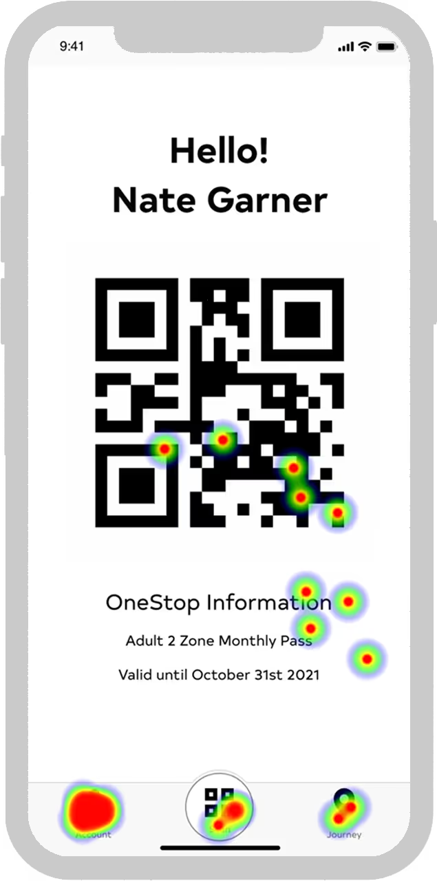
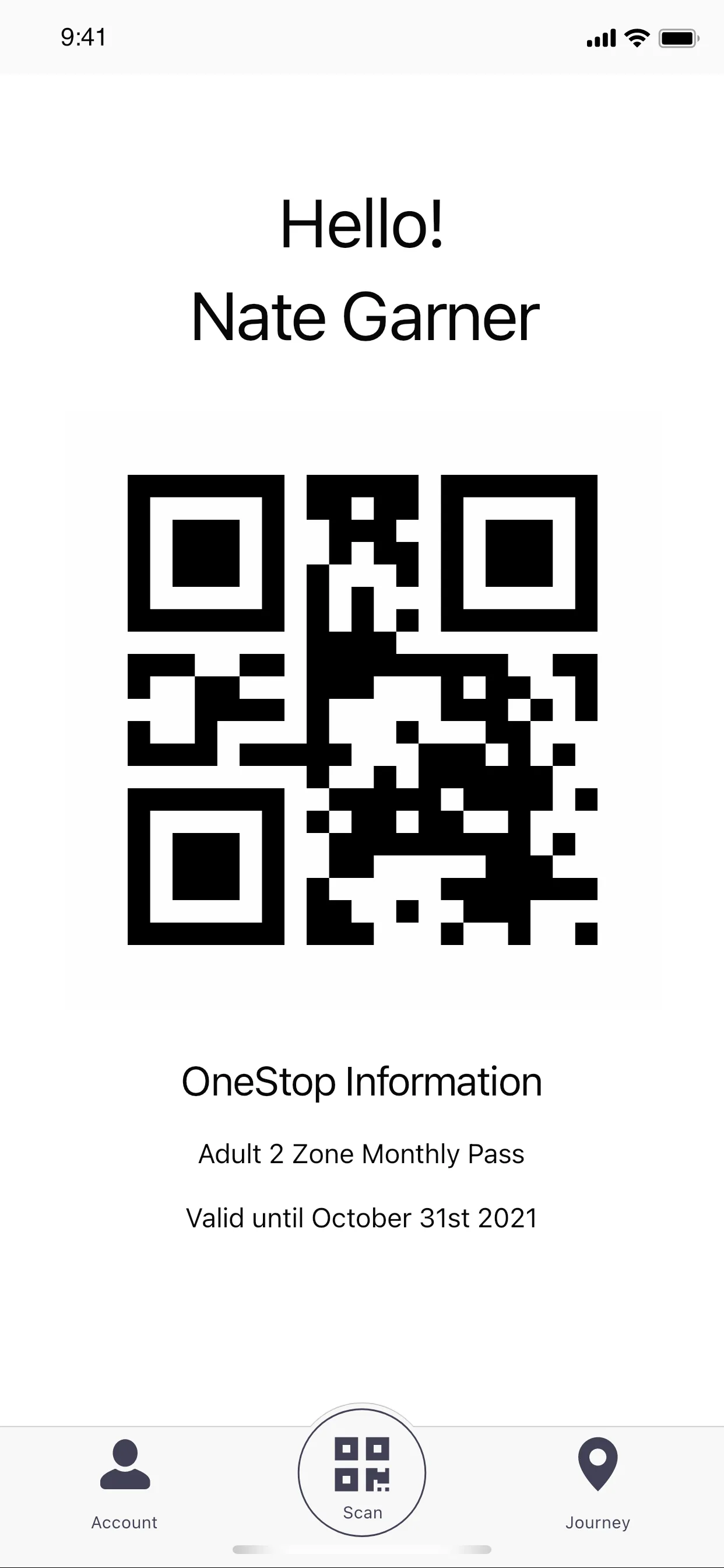
User QR code for gate access, replacing physical cards
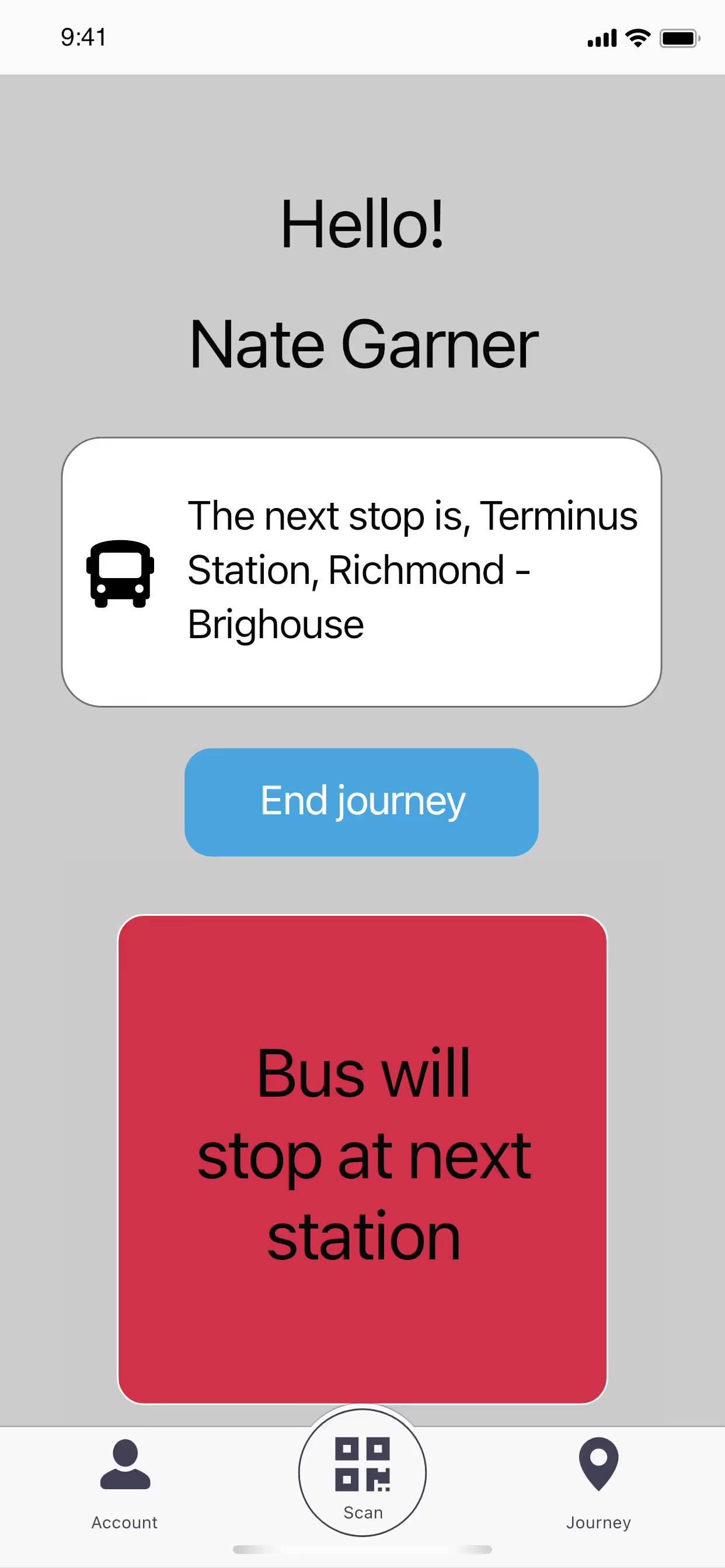
Live updates for route transfers and vehicle status
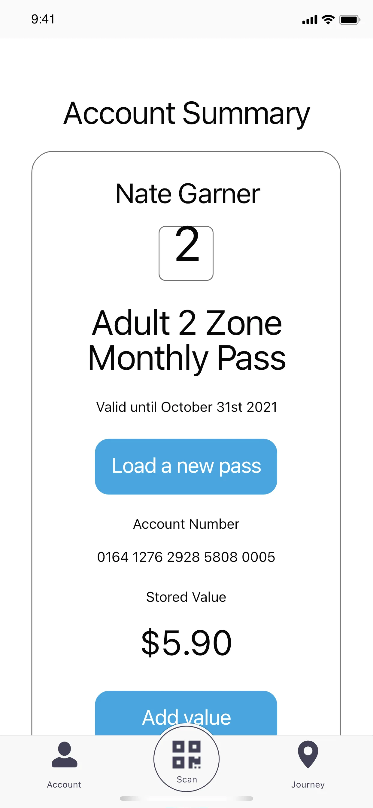
Simplifying account management and fare top-ups to ease commutes
ux research
Conducted a 13-question survey with 35 daily commuters to uncover needs like fare card frustrations and trip anxiety.
Peter Nguyen, 27
Commuter
Vancouver, BC
Paralegal Assistant
“It takes too long to check when the next bus is coming. I usually just wing it.”
“I get confused switching buses, especially if I have to wait outside. I wish it told me what to expect.”
research insight
Commuters and drivers voiced the pain points that guided my solution.
1.
Commuting should be hassle-free and stress-free.
2.
Public transit remains essential for many users.
3.
Cashless payments have become increasingly preferred.
4.
Pre-journey planning remains low.
Dan Wilson, 47
Bus Driver
Burnaby, BC
8 years as a Translink operator
“Sometimes passengers struggle with Compass cards (either they can’t find it, or there isn’t enough balance)—and it slows everything down.”
“If people could just pay with their phone or scan a code, it would make things faster for everyone, drivers included.”
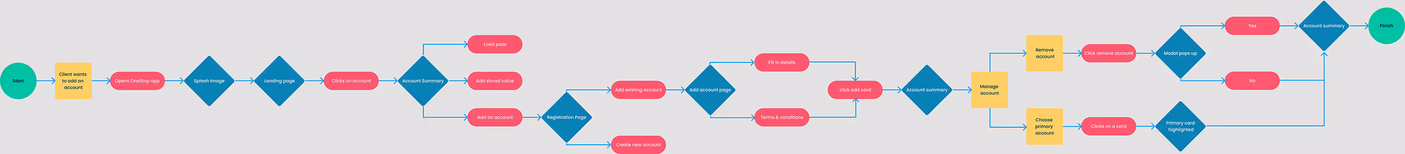
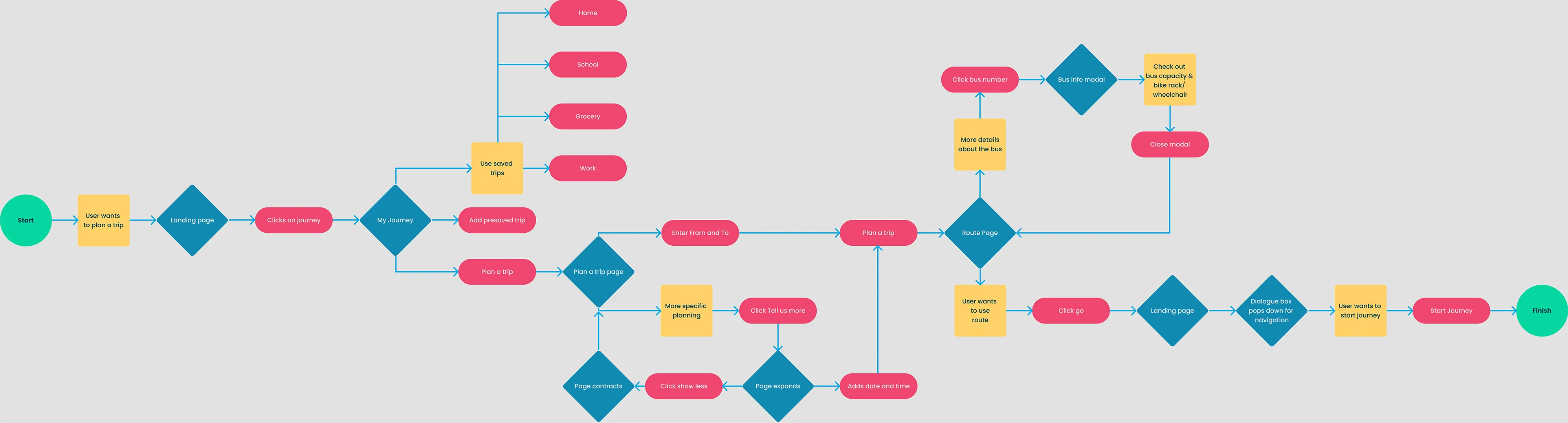
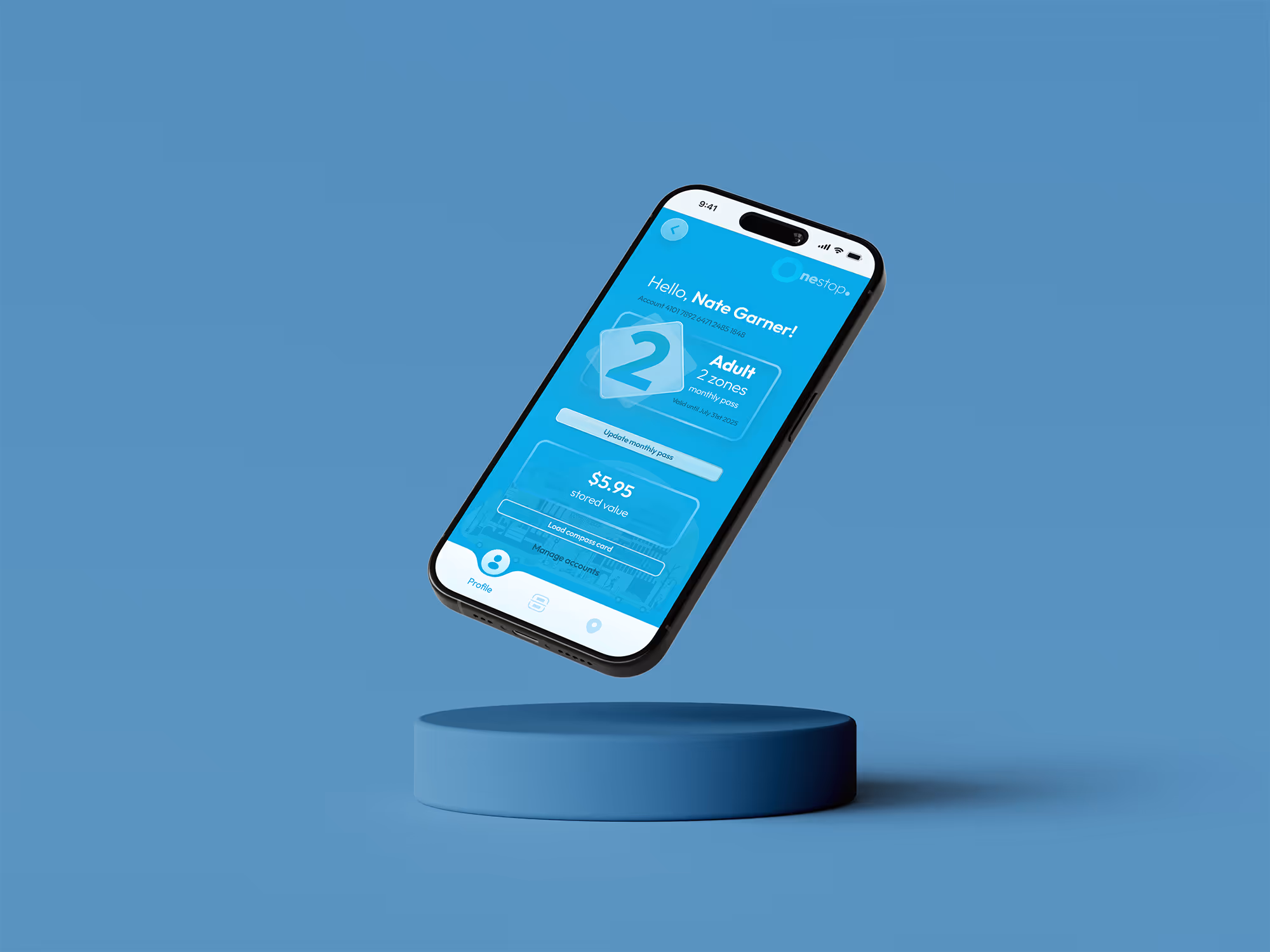
building the experience
Visualizing the commuter journey highlighted key pain points and opportunities.
building the experience
User flows simplified complex transit tasks into a seamless step-by-step experience.
Designing intuitive navigation tool that provide real-time updates and comprehensive vehicle status information, ensuring reliable trip planning.
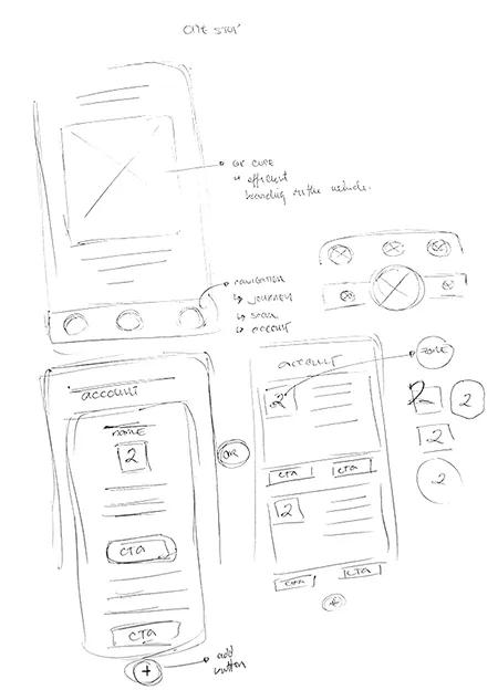
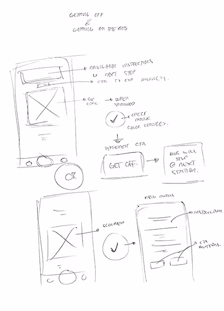
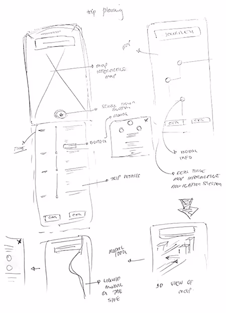
Wireframing
Visualizing OneStop through sketches and lo-fi prototypes to identify issues early and explore different design avenues.
Prototyping with figma
First design hiccup while making wireframes.
At one point, I thought—what if riders could tap their phone to request a stop instead of pulling the cord to let the driver know you'd want to get off at the next stop?
It seemed innovative and accessible, especially post-Covid19 lockdown, but required more technical research. I documented it and refocused on fare management and navigation.
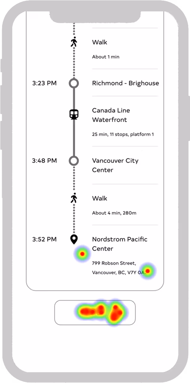
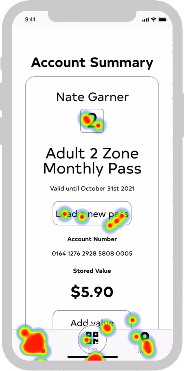
hotjar result
iteration
Streamlining UI for clarity and appeal through hierarchy and dynamic design, followed by retesting.
usability test
“The clean, simple design makes it feel welcoming for everyone.”
“It was super easy to check my bus status without digging around.”
initial design
hotjar result
iteration
Streamlining UI for clarity and appeal through hierarchy and dynamic design, followed by retesting.
usability test
I focused on emphasizing key details and ensuring smooth interactions by refining visual hierarchy through size, color, and spacing adjustments. Post-iteration usability testing involved 10 new participants.
initial design
What I learned
OneStop began as a UX challenge, ultimately boosting user confidence and trust in transit navigation.
Simplicity is key
Commuters don’t want to think too hard when they’re rushing.
1.
2.
Prioritize essential features
Know and understand your user well and advocate for them during decision making.
3.
Full cycle growth
Being involved in every step (UX research to iteration) provided me with an understanding of UX rationale in every phase of the product.
If only OneStop was available in Toronto, this student might not have felt the need to create his own live map of the TTC.
This project was more than building a transit app; it taught me when to push forward, when to pause, and how to focus on real user needs.
If I had more time, I’d keep refining the features, open up accessibility testing, and dive deeper into edge cases—but for now, I’m proud of where this landed.


.avif)
.webp)